Squint First, Color Later: A Notan Fix for Cluttered Illustrations
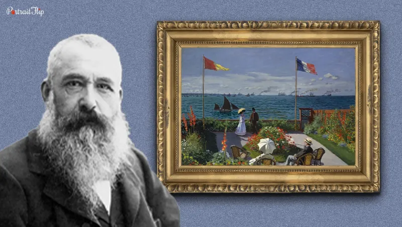
Photo: artist notan thumbnail sketches black white gray values art studio, via www.portraitflip.com
You know the moment. You've been painting or drawing for an hour, the colors are technically right, and the whole thing still looks like a pile of laundry someone shook out on the canvas. Nothing reads. Everything competes. You add more highlights, then more shadows, then a little more detail, and somehow it gets worse.
That is usually not a color problem. It is a value problem, and it has a very old Japanese name: notan.
What Notan Actually Means
Notan is often translated as light-dark balance. That sounds fancy, but the idea is simple. Before you worry about whether a leaf is olive green or yellow-green, you decide which shapes are light, which are dark, and how they sit next to each other. Notan is not a style. It is a seeing habit. It asks you to treat a picture like a pattern of shapes instead of a stack of objects.
In Japanese art and design, that balance shows up everywhere, from ink paintings to woodblock prints to the way a single branch can hold an entire page together. The goal is not maximum contrast. The goal is readable contrast. A dark shape needs a light shape to push against it. A busy area needs a quiet one nearby. If everything is medium, your eye has nowhere to land.
Why Muddy Happens Before Color
A muddy illustration is often a fog of middle values. The darks are not quite dark, the lights are not quite light, and every edge sits in the same gray zone. Color can make that fog prettier, but it cannot fix it. This is why a piece can look decent on your screen at full size and then fall apart in a thumbnail. The thumbnail strips away detail and asks the honest question: does this read as a picture, or just a texture?
Notan forces a decision. You cannot hide behind a hundred little brushstrokes. You have to say, this shape is dark, this shape is light, and this one is the bridge between them. That sounds restrictive. In practice, it feels like taking your foot off the brake.
Exercise 1: The Three-Value Silhouette
Grab a recent sketch or reference photo and make a thumbnail about two by three inches. Use only three values: black, white, and one middle gray. No outlines. No eyelashes. No tiny leaf veins. Just shapes.
Set a five-minute timer and fill in the big masses. Squint if you need to. When time is up, tape the thumbnail to a wall and step back. If you cannot tell what the image is from across the room, the value structure is not doing its job yet. Adjust the shapes, not the details.
This exercise is especially useful for US artists working across traditional and digital tools. A black marker and a gray marker are enough. So is a tablet with three swatches. The constraint is the point.
Exercise 2: The Squint-and-Block
Take a more complicated image, maybe a street scene, a flower market, or a cluttered desk, and blur your eyes until the details dissolve. Now draw five large shapes. Not fifty. Five. Group the darks together. Group the lights together. Let the middle value do the connective work.
Think of this as a bouncer for visual clutter. If a shape does not help the image read, it does not get in. You are not making a finished drawing. You are making a map of where the eye should go first, second, and third.
Exercise 3: The Single-Color Value Map
Pick one color, like burnt sienna, Prussian blue, or even a neutral gray, and make three values with it. In watercolor, that means three washes at different strengths. In digital work, it means one hue at three opacity levels. Map a piece you already finished but felt flat.
This is the exercise that tends to change how people work. You stop asking, what color is this object? You start asking, how dark is this shape compared with the shape beside it? Once that map works, color becomes a guest instead of a fire extinguisher.
A Twenty-Minute Warm-Up for 2026
Here is a simple routine for the week: five minutes for a three-value silhouette, five minutes for a squint-and-block study, five minutes for a single-color value map, and five minutes to compare all three. Do it before you start a final piece, not after. US artists are busy, and this is short enough to fit between coffee and email.
You can also keep a dedicated notan page in your sketchbook. Date it. Number the thumbnails. Over a month, you will start to see your own habits: where you over-darken, where you panic and add detail, where you avoid real contrast because you are afraid of ruining the drawing.
What Changes When You Simplify First
The biggest shift is confidence. When the value structure is already working, you are not decorating a weak image and hoping color saves it. You are designing from the start. Edges get cleaner. Focal points get clearer. Your palette can be soft and quiet, and the picture will still hold up, because the light-dark pattern is doing the heavy lifting.
That is the Japanese heart of this practice, really: respect for balance, space, and clarity. It is not mystical. It is just a habit of looking before you commit. So before you reach for that new tube of paint or open a fresh layer, make three little black-and-white thumbnails. Squint first. Color later. Your muddy illustrations will thank you.