Dipping Into Blue: What One Vat Taught Me About Every Other Color
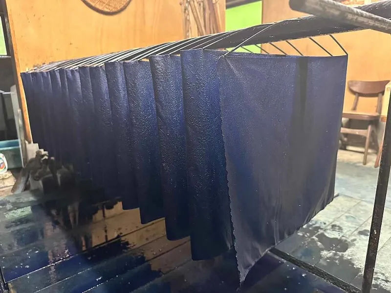
Photo: Markmcnbowe97, CC BY-SA 4.0, via Wikimedia Commons
There's a shelf in my studio that used to be a rainbow. Winsor blues, cobalt tees, cerulean tubes lined up like a paint store ad. These days, most of it collects dust, because almost every blue in my current work comes from one source: aizome, the traditional Japanese indigo that dyers have fermented in vats for centuries.
I didn't plan on becoming a one-color evangelist. It started with a small bottle of indigo ink ordered on a whim from a supplier in Kyoto, the kind of impulse buy that usually ends up forgotten. Instead, it quietly took over my entire palette.
Why Limit Yourself to One Blue?
If you've ever stood in the paint aisle frozen by forty options, you already know the problem: too many choices make decision-making mushy. Indigo flips that. When your entire range runs from a whisper-pale first dip to a near-black that's still, unmistakably, blue, every value decision becomes deliberate.
Traditional dyers talk about depth in terms of dips. One pass through the vat gives you asagi, a sky-soft blue. Repeated dips build toward kachi-iro, the deep triumphant blue once reserved for samurai garments. Layer after layer, the color deepens without ever turning purple or gray — it just gets more itself.
That's the mental shift. Instead of choosing between ten blues, you're asking a better question: how deep does this moment need to go?
The Practical Setup (No, You Don't Need a Real Vat)
Let's demystify this for anyone working at a kitchen table in Ohio rather than a dye workshop in Tokushima. You have a few accessible entry points:
- Pre-reduced indigo ink — bottled and ready, perfect for brush work on paper. This is where most illustrators should start.
- Indigo pigment sticks and pencils — great for sketching and dry texture.
- A small DIY vat — a mason jar, sodium hydrosulfite or a fructose-based reduction, and some patience. Only go here if you want the full fabric experience.
For paper work, I favor cold-press watercolor paper or, better, washi. Kozo-based papers drink indigo beautifully and give that feathery bleed that makes even flat washes feel alive. Expect some feathering on cheaper papers — indigo is a dye at heart, and it travels.
One honest warning: fresh indigo smells faintly like a pond having a bad day. It fades. Mostly.
Building an Image from Dips, Not Colors
Here's the workflow that changed my process. I stopped thinking in hues and started thinking in passes:
- First pass — a pale wash that maps the whole composition. Nothing darker than asagi. This is the sketch and the atmosphere in one.
- Second and third passes — mid-tones go in only where the story needs weight. A figure's coat. A shadow under a bridge.
- The deep dips — reserved for the two or three places the eye must land. If everything is dark, nothing is.
Because indigo darkens as layers build, you get a built-in hierarchy. The painting literally organizes itself around your darkest commitments. I've found my compositions got simpler and stronger — fewer elements, more intention. It's the same lesson as sumi-e: when you can't fix it with another color, you have to fix it with a decision.
Mood, Storytelling, and the Blues
Indigo has a mood baked in. It's the color of work clothes, night trains, old denim, rain on a window. American audiences will feel it even if they've never heard the word aizome — it's the same blue as a well-worn pair of Levi's, which is itself a kind of folk indigo tradition.
For storytelling illustration, that gravity is a gift. A nighttime street scene in indigo feels lonely in a way ultramarine never quite manages. A single warm accent — a scrap of gold leaf, a red seal stamp — sings louder against it. I've started designing entire pieces around one tiny warm note, letting the blue carry everything else.
Tips Before You Take the Plunge
- Test your paper first. Indigo behaves differently on sized vs. unsized surfaces. Swatch everything.
- Thin layers beat thick ones. Glazes deepen the color; a heavy blob just sits there, shiny and sad.
- Embrace the bleed. Wet-on-wet indigo blooms are unpredictable in a way that reads as weather, texture, and atmosphere all at once.
- Let it oxidize. The color shifts as it dries — greener and brighter wet, deeper and bluer dry. Judge nothing until it's fully dry.
- Keep one warm accent in your kit. Indigo loves company, but only a little.
One Vat, Endless Lessons
A year in, I haven't gone full ascetic — there's still vermillion on my desk and a yellow I can't quit. But indigo taught me something no 40-color set ever did: constraint isn't a cage, it's a compass. When every blue comes from the same deep place, you stop decorating and start deciding.
Mix a dip. See how far one color can take you.