One Circle, One Motif: Designing a Kamon-Style Crest for Your Made-Up Household
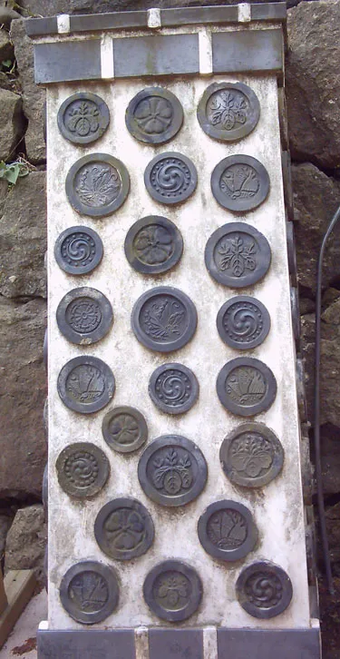
Photo: Pogo747 at English Wikipedia, Public domain, via Wikimedia Commons
Start With a Household, Not a Logo
Most design projects begin with a brief. This one begins with a fiction. Who lives in your imaginary household? Maybe it is a retired lighthouse keeper, two quarrelsome cats, and a person who makes very serious jam. Maybe it is your actual apartment, renamed and slightly mythologized. The point is not to invent a fantasy dynasty with a complicated backstory. The point is to give that household a mark it can wear on a towel, stamp on a letter, or slip into the corner of an illustration.
Japanese kamon—family crests—are a useful model here because they are not logos in the modern sense. They are small, repeatable, and often stubbornly simple. A circle, a leaf, a bird, a character, a geometric lattice. The best ones survive being photocopied, embroidered, carved, and printed at the size of a dime. That is the standard I would hold your made-up household to in 2026: if the crest cannot survive a bad photocopier, it is not done yet.
The Circle Is the Contract
Kamon almost always live inside a circular frame. The circle is not decoration; it is a constraint. It forces you to think about balance, negative space, and silhouette before you start adding flourishes. Think of it as the visual equivalent of a sonnet. You can do almost anything, but you have to do it inside the form.
Start by drawing a circle on a sketchbook page—about two inches across is plenty. Then draw ten more. Small. Do not make them precious. Inside each one, place a single shape. A triangle. A stylized wave. A pear. A key. A cat's ear. A coffee cup reduced to three lines. The goal is not to finish a crest in one sitting. The goal is to notice which shape still reads when the circle is only an inch wide.
A useful rule: if you have to explain the motif to someone looking at it for two seconds, it is too complicated. Kamon are not puzzles. They are signals. They can be subtle, but they should not be coy.
Pick One Motif and Defend It
The temptation is to combine everything. A mountain for resilience, a crane for longevity, a gingko leaf because you like the shape, and a tiny sword because swords are cool. Resist that. A crest with four ideas is usually a crest with no idea.
Choose one motif and give it a job. If you pick a gingko leaf, let it be the whole crest. If you pick a wave, decide whether it curls left or right and commit. If you pick a star, ask whether it is a celestial star, a sheriff's star, or a sticker on a gas station window. The answer changes the drawing.
For a fictional household, the motif can be delightfully arbitrary. Maybe your imaginary family is known for terrible puns, so the crest is a small bird with a speech bubble—except the speech bubble is empty, because the joke is better that way. Maybe your household is defined by late-night pancakes, so you draw a circle with three small steam lines and call it a griddle. The tradition is not in the symbol's ancient pedigree. The tradition is in the discipline of choosing one thing and rendering it clearly.
Draw It Small Before You Draw It Fancy
Kamon are often reproduced at tiny sizes: on kimono, on lacquerware, on curtains, on paper doors. That means the drawing has to work small. Before you open a vector program, make a grid of thumbnails on paper. Draw your motif at one inch, half an inch, and a quarter inch. If the shape turns to mush, simplify it. If the negative spaces close up, open them. If the whole thing looks like a smudge, you have learned something useful.
This is also where you decide on line weight. Traditional kamon often use a single, even line, but you can choose a brushy edge or a crisp vector stroke. Just be consistent. A crest that shifts from delicate hairlines to chunky marker strokes inside the same circle will feel like two drawings fighting for the same apartment.
Ink First, Vector Later—or Vice Versa
There is no single correct order. I like to sketch in pencil, ink the final shape with a brush pen, and then scan it. The scan becomes a reference, not a precious artifact. In a vector program, I rebuild the crest with clean curves and then test it at different sizes. The ink version keeps some warmth; the vector version keeps the crispness. You can use either as the final, or let them be siblings.
If you go straight to vector, try to keep one hand-drawn decision in the mix. Maybe the curve of the leaf is slightly uneven. Maybe the circle is a hair off perfect. Total symmetry is not the goal. Legibility is. A kamon can be formal, but it should not look like a corporate icon assembled by committee.
A Little History Helps You Break Rules on Purpose
Kamon emerged among court nobles in the Heian period, spread among samurai families, and became widely used by commoners during the Edo period. Over time, people developed thousands of designs, often built from plants, animals, tools, weather, and geometric patterns. The history is deep, but the visual lesson is practical: crests were made to be repeated, recognized, and passed down.
That history also gives you permission to borrow structure without pretending to borrow ancestry. You are not claiming a samurai lineage. You are using a design language that has been refined for centuries because it works. If you are illustrating a fictional household, that is enough. If you are making a personal mark, that is enough too. Respect the form, and do not turn it into a costume.
Make It Personal Without Making It Busy
The personal part can live in the details. A slightly unusual motif. A color palette that belongs to your sketchbook. A border that is almost, but not quite, a perfect circle. A tiny asymmetry that only you know about. These are the things that keep a crest from feeling like a stock asset.
Avoid adding text. Monograms are fine, but a crest with initials, a motto, and a founding year is doing too much. Let the image carry the weight. If you want a household name, put it on the envelope, not inside the circle.
The Test: Stamp It, Scan It, Live With It
Once you have a version you like, put it through a few real-world tests. Print it at one inch. Stamp it with an ink pad if you have a rubber stamp made, or just place it in the corner of a drawing. Photocopy it badly. Shrink it. See if it still reads. Then leave it alone for a week. If you still like it after a week of seeing it on your desk, it is probably a keeper.
A crest for an imaginary household is not a binding legal document. It is a small, repeatable declaration: this is the shape of this place, for now. Draw the circle. Pick one motif. Make it survive the photocopier. That is the whole project, and it is enough.