Lunchbox Logic: A Compartment-First Approach to Filling Sketchbook Pages
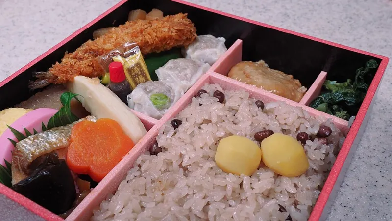
Photo: Ka23 13, CC BY-SA 4.0, via Wikimedia Commons
A blank sketchbook page can feel less like an invitation and more like a waiting room. You sit down, pen in hand, and suddenly every possible subject seems too big, too small, or too obvious. The page is open, the clock is ticking, and nothing happens. I have found one reliable cure for that particular freeze: stop treating the page as an endless field and start treating it like a lunchbox.
Not a fancy lacquered bento from a Kyoto department store. More like the practical kind you pack on a Tuesday morning: a main compartment, a couple of smaller sections, and one bright little thing tucked into the corner. The box does not ask you to fill every inch with a masterpiece. It asks you to make a balanced meal. That is a much easier assignment.
Why a Box Beats a Blank Page
A bento box is a constraint, but it is a friendly one. The compartments say: this is where the rice goes, this is where the protein goes, this is where the pickles go. Nobody expects the pickles to be the size of the rice. The structure prevents the dreaded spill.
For artists, especially those of us working in the US where full-bleed sketchbook culture can feel like the default, that kind of structure is a gift. We are often told to loosen up and fill the page. But filling the page is not the same as composing the page. A compartment-first layout gives you permission to stop drawing before the page is full. It gives you a place for the small stuff. And it gives you a reason to put the pen down.
The translation is simple. One main subject. Two supporting studies. One small pickled detail. The main subject gets the most room. The supporting studies explain it, test it, or look at it from another angle. The pickled detail is the tiny thing that makes the spread feel intentional: a color note, a texture swatch, a single word, a stamp, a scrap of pattern. Together they form a page that reads like a meal rather than a pile of ingredients.
The Four-Part Page, Translated
Think in portions, not inches. The main compartment usually wants about half to two-thirds of the page. The two supporting studies can split most of the remainder. The pickled detail should stay small, maybe a tenth of the page or less. These are not laws. They are starting points.
What goes in each section? The main subject is the thing you came to draw: the coffee cup, the train platform, the neighbor's dog, the houseplant that has seen better days. The supporting studies are not duplicates. They are variations. Draw the handle of the cup. Draw the shadow under the saucer. Draw the dog's ear from memory. Draw the plant's saddest leaf at three times its actual size. The pickled detail is the flavor hit: a patch of burnt sienna mixed on the page, the pattern on a napkin, the blue of a parking sign, a tiny arrow pointing to the thing you almost missed.
This is where the bento metaphor earns its keep. A good lunchbox has contrast: something soft, something crisp, something salty, something bright. A good sketchbook spread has contrast too: big shape, small shape, line, tone, rest. If every compartment holds the same kind of drawing, the page goes flat.
Template One: The Classic Four-Cell
Use a vertical sketchbook. Lightly divide the page into one large rectangle and three smaller ones. The main cell can sit at the top or take the top two-thirds. Put one supporting study below it on the left, another below it on the right, and let the pickled detail run as a narrow strip across the bottom.
This template is excellent for object studies. The big cell holds the whole object. The two small cells hold details, alternate angles, or material notes. The bottom strip holds a color swatch and a handwritten caption. If you hate rulers, do not use one. Fold the page, eyeball the divisions, or mark them with a couple of pencil dots. The lines are training wheels. They can be erased, ignored, or drawn over.
Template Two: The Narrow Stack
Landscape sketchbooks love this one. Give the left half of the spread to the main subject. On the right, stack two narrow horizontal studies like side dishes. Tuck the pickled detail into the bottom right corner.
I like this layout for café sketching because it mimics the shape of a table setting: a wide view on the left, a couple of close-up notes on the right, and a small color reminder in the corner. It also works for figure studies. The main cell holds the full gesture. The stacked cells hold the hands, the shoes, the fold of a sleeve. The pickled detail might be the exact red of a diner booth.
Template Three: The Free-Form Obento
Some bento boxes have no fixed dividers. The food itself creates the compartments. You can do the same thing on a page. Skip the drawn lines. Decide where the main subject goes, then cluster the supporting studies around it, leaving small pockets of white space. The pickled detail can live in one of those pockets.
This version takes more confidence, but it is forgiving. If the page starts to feel crowded, erase a supporting study. If it feels too empty, add a swatch. The goal is visual weight, not geometry. A page can have three distinct zones without a single ruled line.
Portion Control Without Doing Math
Crowded pages usually suffer from too many equal-sized things. The eye does not know where to land. The bento approach fixes that by insisting on hierarchy. The main subject should be obviously main. The supporting studies should be clearly smaller or lighter. The pickled detail should be small enough to feel like a garnish.
Color works the same way. Pick one dominant color, one secondary color, and one accent. Keep the paper neutral. Let the main subject carry the dominant color. Let the supporting studies stay mostly line and shadow. Save the bright accent for the pickled detail. This is not a rule about palettes. It is a rule about distribution. A page with one strong red mark will feel more composed than a page with red everywhere.
The Pickled Detail Is Not an Afterthought
The small compartment is easy to dismiss, but it is often the thing that makes the spread feel finished. A tiny swatch of the exact green from a takeout container. A date written in the corner. A one-line note about the weather. A scrap of ticket stub. These details do not need to be beautiful. They need to be specific.
Think of the pickled plum in a bento: sour, bright, a little surprising. It changes how the rest of the meal tastes. Your pickled detail should do the same thing for the page. It should give the eye a little jolt and remind the viewer that this is a record of a particular day, not a generic exercise.
A Four-Page Practice Sequence
If you want to try this without overthinking it, work through four pages in a row. On page one, draw only the compartments and the main subject. Leave the rest blank. On page two, add the two supporting studies. On page three, add the pickled detail. On page four, repeat the whole sequence with a different subject and a different template.
By the fourth page, the structure will start to feel natural. You will begin to see subjects in terms of main dish and side dish. You will notice small details that deserve their own little corner. And you will probably stop freezing at the blank page, because the page is no longer blank. It is a lunchbox waiting to be packed.
That is the quiet genius of the bento sketchbook. It does not demand a feast. It asks for a balanced meal, neatly arranged, with room for something pickled on the side.