The Pause That Speaks: Learning to Leave Room in Your Art the Japanese Way
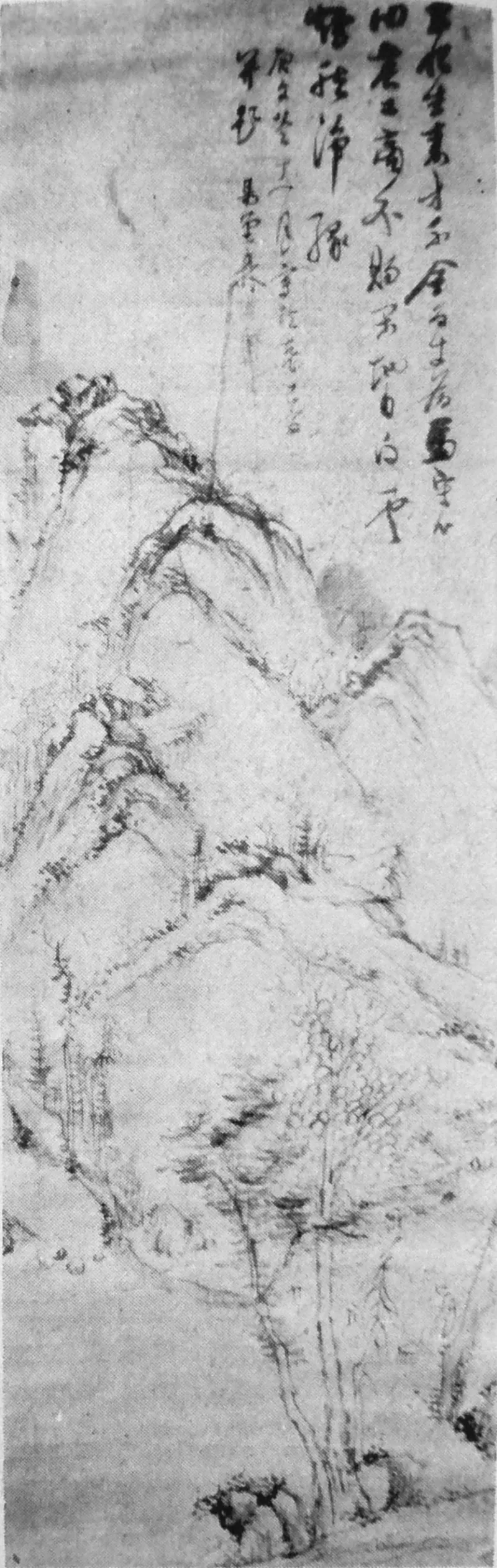
Photo: Teranishi Ekidou, Public domain, via Wikimedia Commons
If you grew up taking art classes in the US, you probably internalized a certain anxiety about blank space. Blank meant unfinished. Blank meant lazy. The teacher's red pen circled the empty corner of your drawing and asked, "What else can you add here?"
Japan spent centuries asking the opposite question: what happens if you take something away?
That question sits at the heart of ma (間) — a concept that doesn't translate cleanly into English but roughly means the intentional gap, pause, or interval between things. It's the silence between two notes in a shakuhachi melody. The empty tatami mat in a tea room. The beat of stillness in a Noh performance before the actor moves again.
For illustrators and designers raised on the "fill the frame" mentality of American commercial art, ma can feel almost rebellious. It's also one of the most practical composition tools you'll ever pick up.
Why Emptiness Isn't Empty
The first thing to understand is that ma isn't absence — it's presence of a different kind. In a traditional Japanese ink painting, the unpainted paper isn't "nothing." It might be mist over a mountain, water beneath a boat, or the mood of a moment. The viewer's imagination completes the picture, and that participation is the point.
Compare that to how most of us work digitally. Photoshop and Procreate make it dangerously easy to keep adding: one more texture layer, one more gradient, one more background element "for depth." The software never gets tired, so neither does the layer stack.
The result is work that shouts. And in a feed where everyone is shouting, the image that whispers is the one people stop for.
A Before-and-After You Can Feel
Picture a typical fantasy character illustration: full-body pose, detailed costume, a background cityscape, magical particles, rim lighting on both sides, and a texture overlay. Technically impressive. Emotionally exhausting. Your eye has nowhere to land because everything is landing at once.
Now apply ma. Push the character to one side of the frame. Let the background dissolve into a single soft wash — maybe just the suggestion of sky. Remove one rim light. Delete the particles.
What's left? The character suddenly has room to exist. The silhouette reads clearly. The viewer's eye rests on the focal point instead of sprinting across the canvas. Same subject, same skill level — completely different impact.
This is the before-and-after I run in workshops, and the reaction is always the same: relief. People don't miss the clutter. They miss the space, even though they didn't know they were missing it.
Three Practical Exercises in Restraint
Ready to try it? These drills take less than an hour each and work in any digital tool.
1. The 60% Rule. Take a finished piece and force yourself to delete or obscure 40% of it. Merge layers, flatten backgrounds, erase elements. You're not trying to make it worse — you're hunting for the parts that were doing the emotional work versus the parts that were just... there. Most artists are shocked by how much they can remove before the piece breaks.
2. One-Color Background Week. For seven days, every illustration you make gets a flat, single-color background. No gradients, no environments. This constraint teaches you how much storytelling the figure alone can carry, and how a well-chosen flat color (think warm cream, deep indigo, sumi-ink gray) creates mood all by itself.
3. The Pause Sketch. Draw a subject using nothing but three brushstrokes and the untouched paper. That's it. This is borrowed directly from Zen ink painting (sumi-e), where the unpainted area is considered part of the stroke. It's frustrating at first. By sketch ten, something clicks — you start designing the emptiness instead of fearing it.
Ma Beyond the Canvas
Once you start seeing ma, you see it everywhere in Japanese design: the generous margins of a book spread, the whitespace in Muji packaging, the pacing of a Studio Ghibli film where characters just... ride a train for a while, and the scene is better for it.
There's a lesson there for American creatives, too. Our culture rewards hustle, output, more. Ma suggests a different metric: not how much you put in, but how much room you leave for the viewer to enter.
The next time a piece feels off but you can't figure out why, resist the instinct to add. Ask the ma question instead: what can I take away?
The answer might be the best thing you never drew.